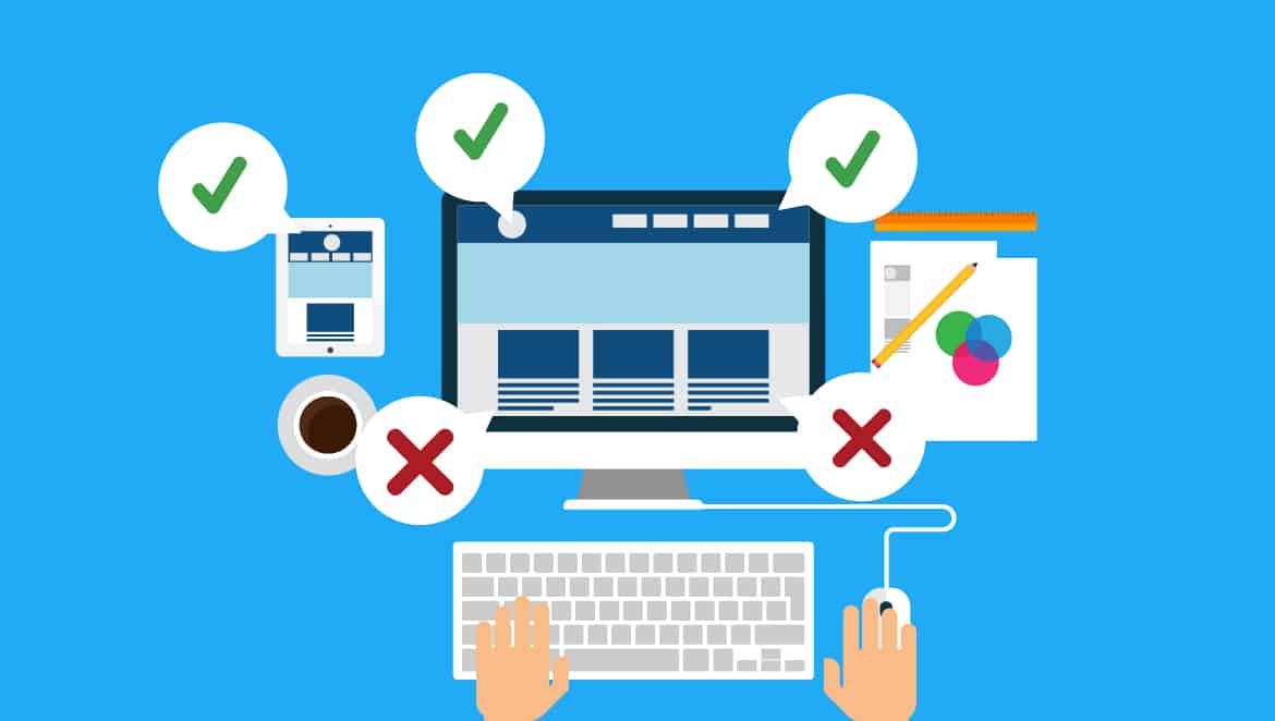

Getting your website design nailed on perfectly is not easy. Most of the time business owners think they got it the way they want it, but it’s far from the case. Many owners don’t realize the mistakes they are making when creating their websites – and it’s hurting their business and its online reputation. As website designers ourselves, we know what mistakes business owners should be looking out for and we have listed them for you, so you too don’t fall into the same trap.
Your design is too busy or flashy.
A website should be easy upon a user’s eye. Most users know what they want when they click on your page; it’s up to you to make it easy for them to see it. This includes everything from having proper high-quality images to the perfect size texts (too small means too hard to read; too big means you lack proper content). Nailing down the right color scheme, logo, and layout is essential. Having a website that is too flashy, busy, overloaded, or in the opposite manner, too empty, too dull is going to turn off your future customers from using your site.
Navigation is a mess.
You have to make it easy for your users to search through your website design. What turns users off from coming back to your site is the difficulty for them to find what they want. Navigation should be seamless and easy, guaranteeing that users stay on your site longer and return more often.
Where’s the clear call to action?
Why are users on your site in the first place? You’ll have to figure that out, and when you do, you’ll have to make them get active on your website by establishing a “call to action”. That could be a button to press to buy a product, contact you, subscribe to your monthly newsletter, or submit a quote. The call-to-action signal must lead your users to the next step of the purchasing process.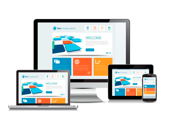
Keeping your website updated.
Imagine you jump on a website and see that the last post, update, or advertisement is several months old. Aren’t you going to think that the business is done and dusted? Users, and potential customers, jump on your website with the hope that they contain the latest information. When it doesn’t, they think you’re out of business, you’re too lazy to update your website, or worse, you just don’t care. Keep updating it with fresh content from your business activities, however minor they might be.
That homepage represents you!
The homepage is the hardest and essentially best page you have to create. Why? Because it represents everything your business stands for: what you offer your customers, how you plan to give it to them, and why they should stay and continue to come back to your site. Your homepage has to be all about your business.
Where’s the mobile version?
Let’s face it: people use their mobile phones for the Internet more than their actual computers. One of the biggest killers for small businesses is not having a mobile version of their website. The hassle of stretching out the screen to find what they want and the difficulty of navigating through a non-mobile-friendly website can completely kill a user’s experience. Make sure to get your website “mobile friendly” as soon as possible because users are bound to find it on their phone instead of their computer.